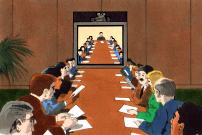
More comp renderings from the same series as the last post. In this group I didn't have to do single and double spread versions which simplified things a bit, although I still had a tough deadline as usual. I don't recall which ad agency or who the Art Director was on this series of ads.
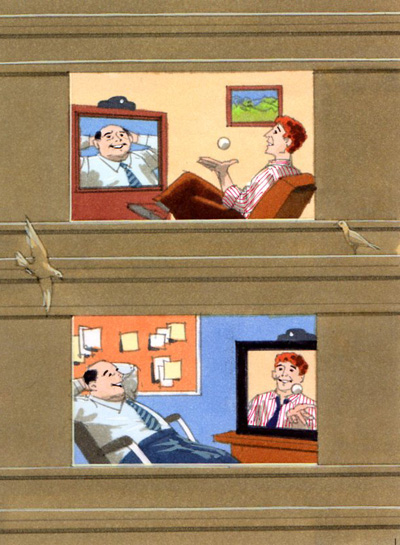

This was a strange idea, two bugs communicating which each other. Sometimes you're asked to do some pretty weird things.
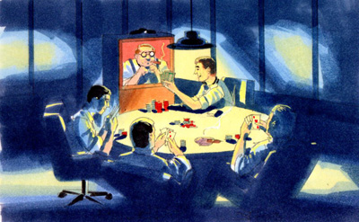
These ads were all rendered using markers on high quality layout paper and done under the pressure of a tight deadline.


2 comments:
Hi Harry,enjoying looking at your work and impressed by your speed of turnaround.My main question is, how did you generate color schemes for this work,because bad color combinations can really louse up a good design and obviously you didnt have ages to experinent with each panel?
Hi Allen.
That's a good question. Experience helps, I've had over 40 years of doing hundreds of storyboards and comp renderings and usually have a visual image in my mind of the color scheme before beginning to render. One key here is to keep the renderings fresh, overworking the rendering will make it look muddy and dull. Another important key is to use the right paper, some layout papers just do not take markers very well. I always use Bienfang Graphics 360 paper, but turn the paper over and render on the reverse side which takes markers much better. For beginners I would suggest first doing small color sketches before starting the final rendering. Fast and fresh is the key to nice looking renderings. Probably a bit of experience with watercolor painting would be a big help.
Post a Comment