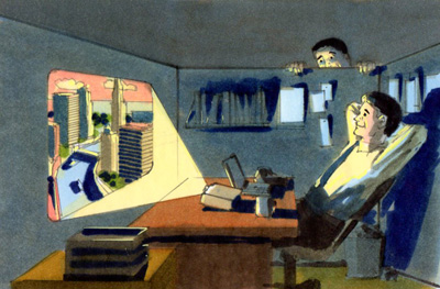
The double spread version is above and the single page rendering is below.
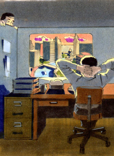
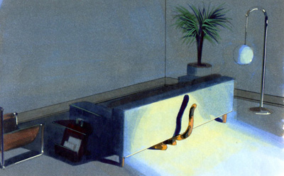
In this case I tried a different concept for each version.
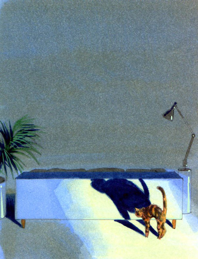
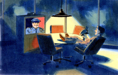
On this concept I was able to keep the visuals similar.
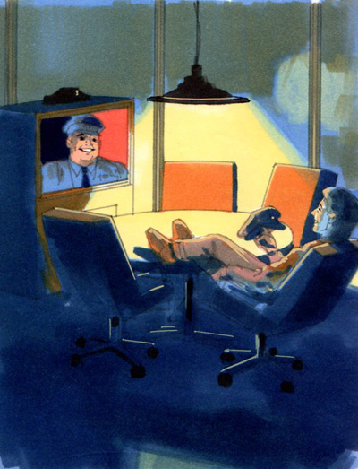
These examples demonstrate some of the unique problems comp artists can face on certain assignments.


1 comment:
Hi Harry,
I've tried to send you an email but it keeps bouncing back.
Dave Loew
http://www.davidloewphoto.com/fineart/
Post a Comment