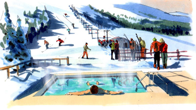
Here's an illustration of a ski resort with a guy in the foreground heated swimming pool.

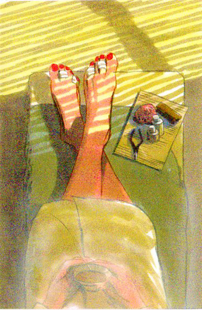
A lady waiting for her toenails to dry. The foreground area is lighter because type was going to be placed there in the final version.

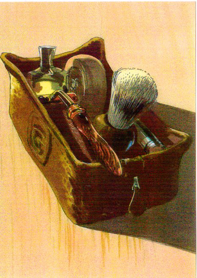
An old shaving kit. You never know what you might be asked to render. These were all done using markers on high quality layout paper and probably done under great pressure.

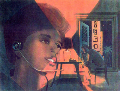
An illustration of a man using the telephone in an oriental hotel room, the Art Director wanted the face of a telephone operator superimposed in the scene. This was an interesting visual concept. I'm not sure that any of these ever survived the meetings and became national ads. Most ad comps find their way to the dumpster.


No comments:
Post a Comment