Monday, February 28, 2011

An ad comp illustration and catalog work

This is the last rendering that I could find, so I've run out of storyboard and ad comps to post. This particular layout was for a magazine ad, I don't recall the client, ad agency or art director. It was a large 12 x 18" rendering done using markers on layout paper.

IslandLady

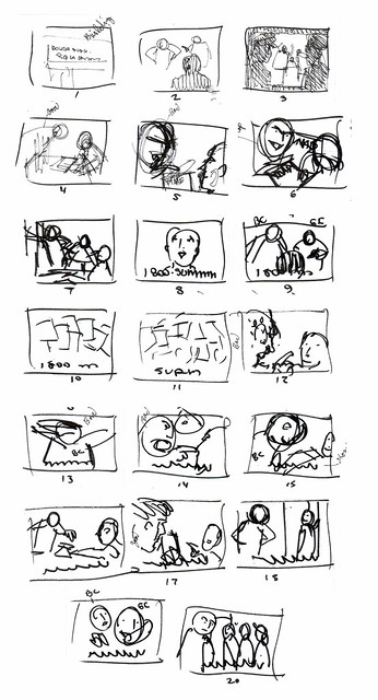
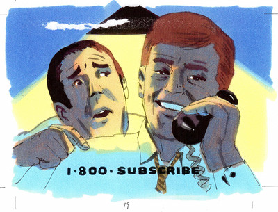
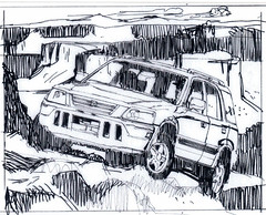
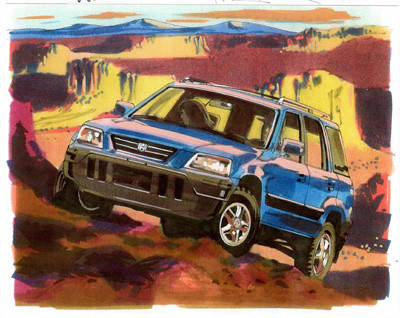
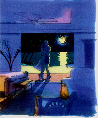
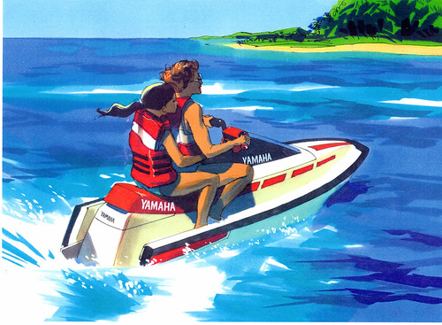
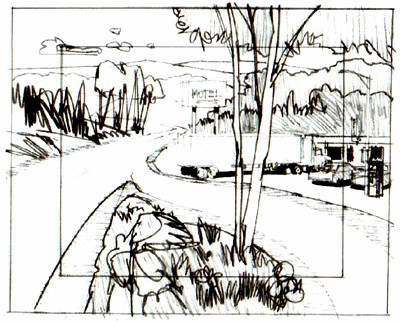
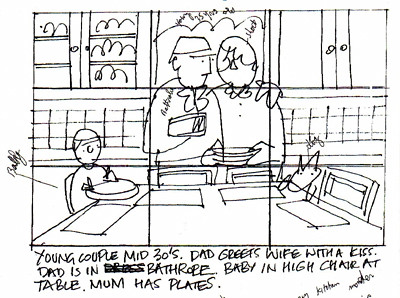
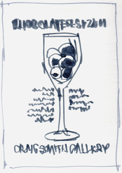
Below is an example of how I develop a page layout for an automotive catalog.

1bOOk548
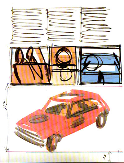
I first make a very rough color sketch which is often shown to the art director to see if I am on target.

1bOOk549
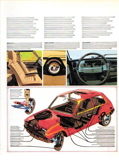
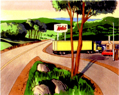
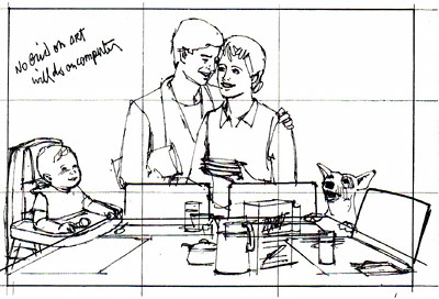
If the sketch is approved, I the do a comprehensive layout which is put together with all of the other pages as a catalog. This then is presented to the agency's client for approval.

1bOOk550
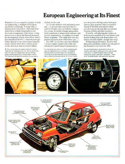
The comp layout is used by the artists and photographers as a guide for the art and photography.

1bOOk547
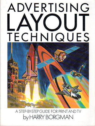
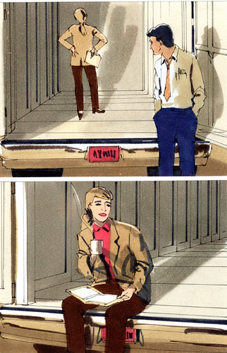
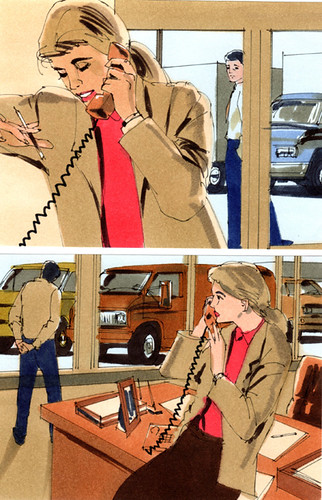
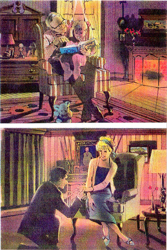
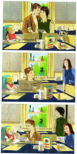
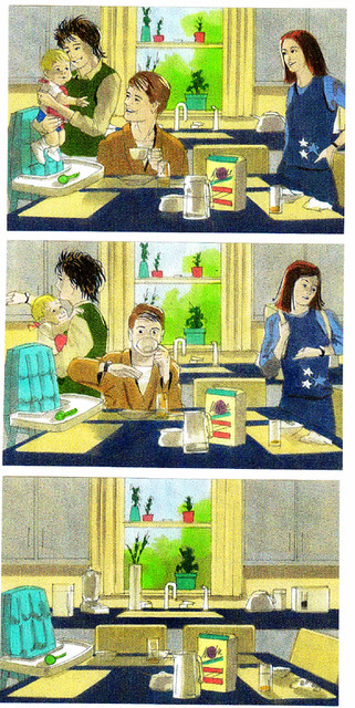
If your are interested in seeing more comp layouts and storyboard work pick up a copy of my book Advertising Layout Techniques. I wrote this book in 1983 and it was published by Watson Guptill Publications. You can find used copies on the internet.

Friday, February 25, 2011

More American Express frames

Here are the rest of the frames from the previous post totaling 12 frames. Often these assignments would involve doing several different series of boards which could add up to as many as 96 frames or so. With the usual tight deadlines, this meant a lot of night work and no sleep. As on the previous group I used an airbrush to soften some of the tones a bit.

1Amex4

1Amex5

1Amex6

Wednesday, February 23, 2011

Storyboard frames for American Express

This was a fun project to render in spite of the usual tight deadline. I don't recall the ad agency or the art director's name, but it probably was done for one of my New York clients. These frames were 4 x 5" and rendered using markers on layout paper.

1Amex51

1Amex2

1Amex3
They are rendered in my usual technique, first I draw everything using a technical or marker pen, then I add the color. I even used an airbrush on the last two frames. On the next post I will show the other six frames in this series.

Monday, February 21, 2011

Memorial

1Jeanne

How I develop storyboard frames

Often I would have to do quick sketches in the art directors office to show him how I will develop his ideas and to see if I was on the right course. After that I would do tighter sketches at home which I might also send to him over the internet. These final sketches would be used as underlays when drawing up the final frames that were to be rendered using markers.

Sketches
Here is an assignment from A. Eicoff and Company of Chicago, a client that I did a great deal of work for. The Creative Director was Larry Vienna. I did these quick, simple diagram sketches for an assignment that he gave me, 20 storyboard frames in the 4 x 5" size. He could easily visualize what I had in mind from these roughs and gave me the go ahead.

Subscribe
Here is the finished frame number 19, the only one that I could locate, but it gives you a good idea of what they all looked like.

Honda copy
A Series of frames for Honda, I don't recall the ad agency that they were done for, probably one of my New York clients. This sketch is one of a series that I sent to the art director for approval before going ahead with the final renderings. Automotive clients normally required fairly tight preliminary sketches like this as often they would be shown to their client which would have been unable to visualize very rough sketches like those earlier ones shown above. Of course, all this took time away from the normally short deadlines.

Honda
Here is a finished frame from the series of 10 that I did for Honda. These automotive renderings had to be tight and detailed so I had to have pretty good reference material to work with which clients rarely supplied.I often would go to the car dealership and take reference photos. Reference material could also be found on the internet. I always tried to keep my renderings clean, fresh and not overworked.

Friday, February 18, 2011

Marker comps for magazine ads

I've rendered countless marker illustrations for magazine ad comprehensive layouts. They usually come in batches of several illustrations that had to be done for an agency client presentation. The time requirements can be as brutal as storyboard deadlines, often requiring a tough weekend of work. I believe that these renderings were done for one of my Chicago clients. Before I got a computer I would have to take the train to Chicago to deliver the work, about an hours ride from Chesterton, Indiana, where I would catch the train.

1Aframe532
Here would be a fun place to be instead of suffering this tough Michigan winter. Dancing with your honey in some exotic, warm tropical place. These renderings were all done about 12" wide with markers on high quality layout paper.

1Aframe535
I think that this rendering depicted Shanghai, not quite sure, but it looks like another fun place to be this winter.

1Aframe534
A full size close up of the figures from the previous scene, giving you an idea of the tightness of the rendering.

1Aframe533
Another fun image to render, a cute lady with a parrot.

1Aframe536
I may have posted this image before. This is how detailed my comp renderings are, fairly loose and fresh, which results in a clean, crisp illustration. Overworking marker renderings will result in drab, uninteresting images. Having experience in painting with watercolors can be a great help in doing fast, clean marker renderings.

Wednesday, February 16, 2011

A few more storyboard frames

I found a few more storyboard frames in an old file. These were done for one of my New York clients, not sure just which ad agency or who the art director was. These 4.5 x 6" frames are good examples of the rendering technique I used under tough deadline conditions. I basically did a fine ink line drawing and added the color over it, a simple, fast technique. I'm pretty certain that there were several additional frames, but these are the only ones that I could locate.

1STryBD519

1STryBD51

1STryBD518
This close up shows the looseness of the basic ink line drawing as well as the marker technique used to complete the rendering. When rendering quickly with the color markers, the tones are softened and blend slightly together, creating a nice image.

Monday, February 14, 2011

Cartoon for Penthouse

While rummaging through some old files looking for more storyboard frames to post, I found a sketch that was drawn for a cartoon that I submitted to Penthouse Magazine. Just before I moved to Paris I was trying to think of ways I might still have some income from the States as I wasn't sure just what would happen there business wise. One idea that I came up with was to write "How to..." books for Watson Guptill and I submitted ideas to them and they were accepted. The other idea that I had was to submit cartoons to Playboy or Penthouse. I sent some ideas to Penthouse that were accepted and I thought that I had it made. They bought three or four but after I moved to Paris I had no more luck with my submissions.

Penthouse Cartoon1
Here is one of the sketches that were accepted.

PenthouseCartoon2
Here is the finished cartoon which was rendered using Windsor and Newton Designer's Colors. A fun image to paint.

Friday, February 11, 2011

Animatic frame and more storyboards

I found a couple more items to post. I would often get complicated assignments called animatics. These would consist of large renderings and most would have moving parts. They would be used to create a film that would give the client a better idea of what the TV commercial would look like. I normally had several days to render everything but it still was a pretty tight schedule to meet as the frames had to be thought out very carefully and rendered tighter than normal storyboards.

Truck2
Here is a typical pencil rough which I would submit to the art director for approval before rendering the frame. The inner rectangle defines the area of the actual scene, but they always wanted me to add more, just in case.

Truck
This is the finished rendering which was about 15 x18" in size. this particular frame had no moving parts and shows you how detailed it was. I did not locate any other frames from this assignment, this frame gives you a good idea of what is involved in this type of work. Some animatic assignments can be very complex as you might imagine. They can be very effective when shown on film.

People3

People4
These storyboard frames were part of a series for one of my New York clients. These 5 x 7" frames are rather detailed and rendered tighter than I normally work.

Wednesday, February 9, 2011

Random commercial rendering assignments

I'm running out of storyboard and ad agency assignments to post, still searching through old files hoping to find more material. There's not much chance of locating work done before 2000, as the originals were always sent to the client by FedEx. When I got my computer, scans were always sent to my clients over the internet and most of the original renderings were saved.

1CoMps503
A rendering for a magazine ad, not sure who the client was or just which ad agency it was done for. It's a marker rendering and quite typical of my work. I like to keep my renderings clean and fresh, not overworked.

Tropicana
Often an art director would request a very tight rendering like this one. The client was Tropicana but I don't recall the ad agency or the art director.

People
These 5 x 7" storyboards are very typical of my very fast rendering style that I employed when the deadlines were brutal, and many were. I first drew the scene using a technical pen then colored it with markers, a fast method that always looked fresh, most art directors were quite happy with this technique. In all the years that I did storyboards and ad renderings, I never missed a deadline. In fact, missing a deadline in this business will give you one less client to work for.

People2
Assignments like these would often come in a series of perhaps 8 or 10 different commercials that were needed for a large ad agency client presentation. Sometimes they would change their ideas and I would have to alter certain frames or even add new ones. It's not an easy business by any means, but it can be very rewarding.

Monday, February 7, 2011

More rush storyboards

This assignment was faxed to me at 8:00 pm on a Friday night and was due in New York on Monday morning. There were 12 large frames, 6 x 9" plus bleed.

Family1
Here is one of the sketches that the art director sent me as a guide. My instructions were to keep certain elements within the grid shown on his sketches. The grid would be added later by the art director.

Family2
Here is one of my preliminary sketches that I sent to the art director on Saturday for approval.

Family3

Family4
Here is part of the group of frames, they were all rendered using markers on high quality layout paper, a typical over the weekend assignment. The last year that I worked in that field, every assignment had a brutal deadline. Storyboard artists always work under a great deal of pressure. If you don't work well under extreme pressure, this is not a career for you.

Friday, February 4, 2011

Some eariy fine art ventures

Throughout my career as a commercial artist I have been involved with many fine art projects, exhibiting in galleries, museums as well as entering various competitions. Here are some prints that I did during the mid 1960's. I was taking a few classes in printmaking at the Society of Arts and Crafts school. At this time, my former painting instructor, Sarkis Sarkisiam, was the head of the school. He asked me to take over the Advertising Department and teach several Illustration and graphic design classes. I accepted the offer and taught there for about four years.

Print2
A print which was first drawn on a lithograph stone, then printed.

Print3
This is a woodcut, the design being carved onto a wood block, inked, then printed on a hand press.

Print
An abstract figure study drawn on a litho stone, then printed on a press. This study is very much like my recent figure studies created on the computer and used as a basis for my new painting series.

Coy Nude
One of my new abstract figure study paintings.

Wednesday, February 2, 2011

Outrunning a giraffe

A storyboard featuring a native outrunning a giraffe. I don't remember the ad agency, art director or the client on this assignment, but I enjoyed rendering these frames. The were done in the 5 x 7" size using markers. I'm certain that this was also another overnight assignment.

Runner1

Runner2

Runner3

Runner4

Tuesday, February 1, 2011

Designing a new poster for my gallery

The Craig Smith Gallery has decided to have a Chocolate Fest event every Saturday evening in February and needed an announcement poster. Drop by if you can and have a bit of fun, you can meet some of the artists too.

123CSPoster
The final rough sketch, I had visualized several other concepts in my mind, but decided on this version.

CraigSmithPoster Small
Here is the finished poster. I took a couple of photographs and assembled the whole thing on my Mac computer.

2011 January
WOW ! Can you imagine January already being gone? In the midwest we will all be happy when Winter leaves, it's been a tough one . We are all expecting a BIG snowstorm here in a day or two.