This was a fun project to render in spite of the usual tight deadline. I don't recall the ad agency or the art director's name, but it probably was done for one of my New York clients. These frames were 4 x 5" and rendered using markers on layout paper.

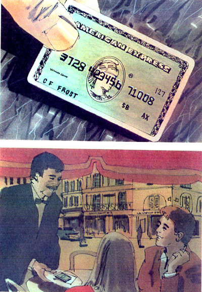
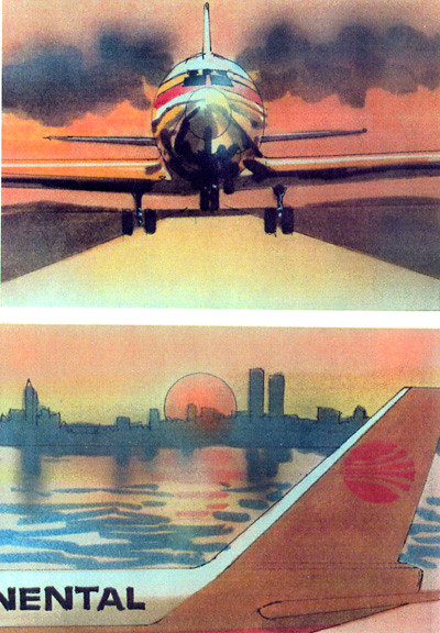
They are rendered in my usual technique, first I draw everything using a technical or marker pen, then I add the color. I even used an airbrush on the last two frames. On the next post I will show the other six frames in this series.


No comments:
Post a Comment