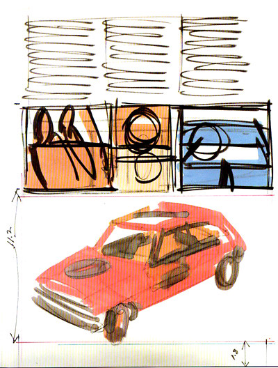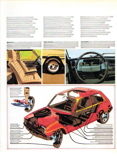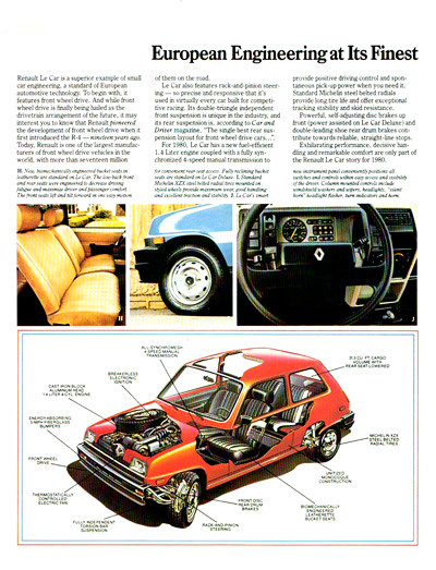
Below is an example of how I develop a page layout for an automotive catalog.

I first make a very rough color sketch which is often shown to the art director to see if I am on target.

If the sketch is approved, I the do a comprehensive layout which is put together with all of the other pages as a catalog. This then is presented to the agency's client for approval.

The comp layout is used by the artists and photographers as a guide for the art and photography.

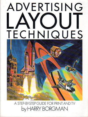
If your are interested in seeing more comp layouts and storyboard work pick up a copy of my book Advertising Layout Techniques. I wrote this book in 1983 and it was published by Watson Guptill Publications. You can find used copies on the internet.


No comments:
Post a Comment