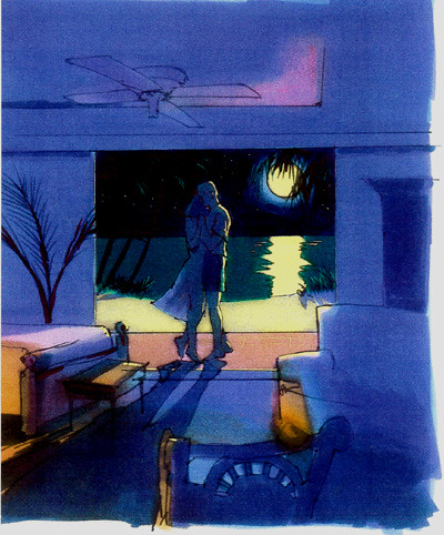
Here would be a fun place to be instead of suffering this tough Michigan winter. Dancing with your honey in some exotic, warm tropical place. These renderings were all done about 12" wide with markers on high quality layout paper.
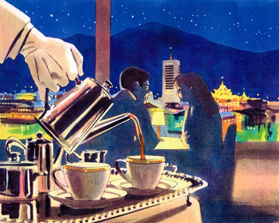
I think that this rendering depicted Shanghai, not quite sure, but it looks like another fun place to be this winter.

A full size close up of the figures from the previous scene, giving you an idea of the tightness of the rendering.

Another fun image to render, a cute lady with a parrot.
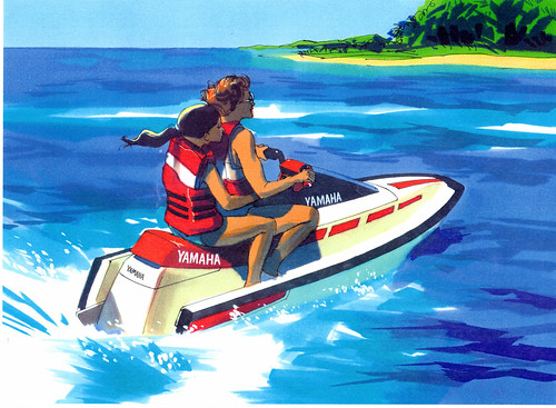
I may have posted this image before. This is how detailed my comp renderings are, fairly loose and fresh, which results in a clean, crisp illustration. Overworking marker renderings will result in drab, uninteresting images. Having experience in painting with watercolors can be a great help in doing fast, clean marker renderings.


No comments:
Post a Comment