Monday, May 31, 2010
Friday, May 28, 2010
My best selling book
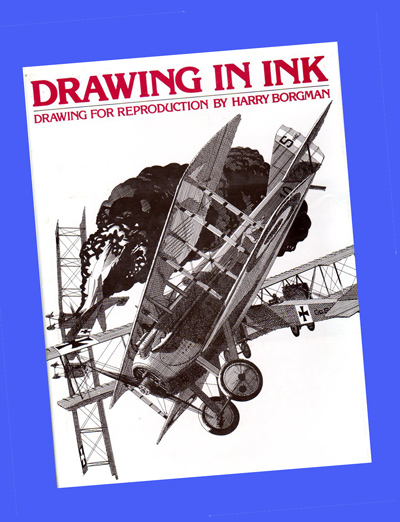
Published in 1977, Drawing In Ink was my top selling book. It is still available on the internet at bargain prices ranging anywhere from 15 cents through $5 and up. If you are interested in ink line drawing techniques pick up a copy, it is full of actual line art assignments done for a variety of clients, for five bucks you can't go wrong.

Line art from the book which was used for an ad advertising my work.
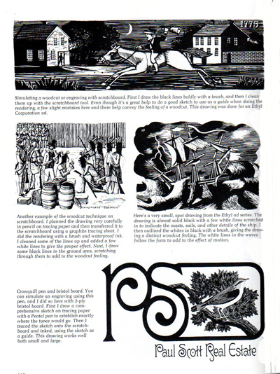
Throughout my long career I have worked in many different styles and techniques and you will find lots of examples in this book.
Wednesday, May 26, 2010
More from my layout book
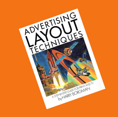
In my last post I recommended my book Advertising Layout Techniques for artists interested in layout and comp rendering. I checked Amazon and Google for availability and prices and was astounded at the wide price range from one cent ( yes, ONE cent !!!), twenty cents, ninety-nine cents, all the way up to $133.85 ! Bargain hunters, have fun.
A few years ago I did a brochure for the Premier Corporation in Michigan. The Advertising Manager for Premier was Jim Donahue, a wonderful person who helped me a great deal early in my commercial career. I kept in touch with Jim through the years and did quite a bit of work for him. On one occasion, he even sent me to Japan on a great assignment.
Here are the initial rough idea sketches I did to establish the cover design.

This is the comprehensive layout that was submitted for Premier's evaluation.

The final printed cover, it was a fun assignment as was most of the work done for Jim.

A few years ago I did a brochure for the Premier Corporation in Michigan. The Advertising Manager for Premier was Jim Donahue, a wonderful person who helped me a great deal early in my commercial career. I kept in touch with Jim through the years and did quite a bit of work for him. On one occasion, he even sent me to Japan on a great assignment.

Here are the initial rough idea sketches I did to establish the cover design.

This is the comprehensive layout that was submitted for Premier's evaluation.

The final printed cover, it was a fun assignment as was most of the work done for Jim.
Monday, May 24, 2010
Advertising Layout Techniques book
Having taught at an art school for a few years I tried to find books on rendering storyboards and ad comp layouts to recommend to my students, without success. I decided to write a book on the subject in 1982. This book is out of print but can still be found used and very reasonably priced on the internet, try Amazon.com and Google for other used book dealers.
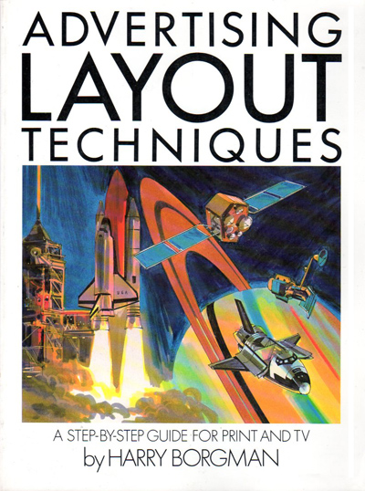
The book covers tools and exercises, the development of a layout assignment, many step-by-step instructions, typical assignments and how to get started in this field. It's a good book for beginners as well as established artists as I show actual assignments that I was working on at the time in Paris, France as well as work from the U.S. during this period.
I am in the process of trying to find more examples of storyboards and ad comp work that I have done, I've actually run out of things to post. Most work done before I started delivering over the internet in 2000 was delivered to the ad agencies and usually there was no time to have copies made. Luckily I saved most of the work done after 2000 and have posted a great deal of it.
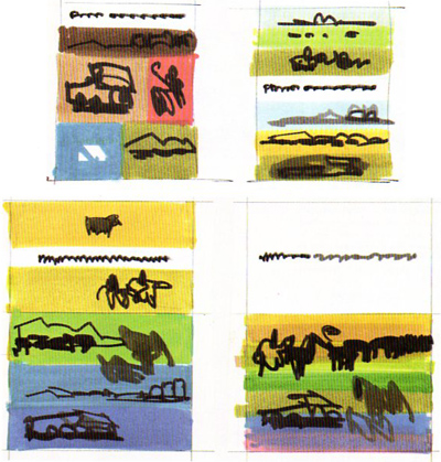
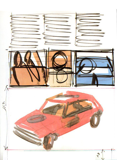
Here are examples of layouts from the book which were done for a Renault catalog, the top one is a rough that I did before the final comp layout shown below


Friday, May 21, 2010
Starting a new painting
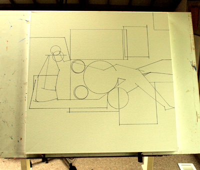
I just finished sketching the drawing for an abstract figure study for my new painting series which are hanging in the Craig Smith Gallery in Harbert, Michigan. I have to produce a few more in this series as my gallery in Puerto Vallarta wants to exhibit them. Also, a gallery in Cincinnati recently contacted me and is very interested in exhibiting them, so off to work I go.
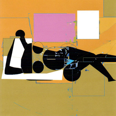
Here's the color sketch for the painting, which, like all the other sketches, was created on the computer
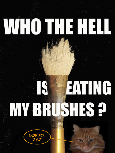
My cat Tiff has been nibbling on my brushes, you just never know what the cats are up to.
It looks as if I have run out of storyboard and ad comp material to post. If I run across more examples, I'll be sure to post them.


Here's the color sketch for the painting, which, like all the other sketches, was created on the computer

My cat Tiff has been nibbling on my brushes, you just never know what the cats are up to.
It looks as if I have run out of storyboard and ad comp material to post. If I run across more examples, I'll be sure to post them.
Wednesday, May 19, 2010
Larger, tighter storyboard frames
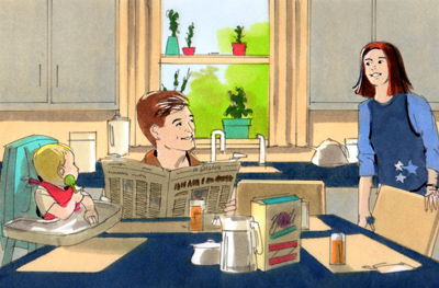
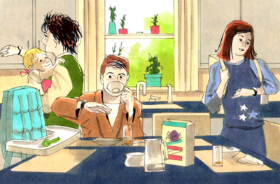
Here is a storyboard assignment where the ad agency required large 6 x 9" frames rendered tighter than my normal work. This may have been an animatic without moving parts, I don't remember. Nor do I recall the product, Art Director or ad agency, but I know that it was done for one of my New York clients. Apparently I had a little more time on this assignment than the usual frantic deadline. This was probably done somewhere around 2002 and was rendered using markers on high quality layout paper.




I've just about run out of storyboard and ad comp material to post. I will, however, check out some old portfolios to see if there are more rendering hidden somewhere.
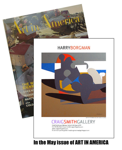
The Craig Smith Gallery ran a full page ad in the current issue of Art in America featuring one of my new abstract figure paintings. Check it out if you have a chance.


I've just about run out of storyboard and ad comp material to post. I will, however, check out some old portfolios to see if there are more rendering hidden somewhere.

The Craig Smith Gallery ran a full page ad in the current issue of Art in America featuring one of my new abstract figure paintings. Check it out if you have a chance.
Monday, May 17, 2010
Animatic frames for Yoplait
Often I would get complicated assignments like this animatic which was done for Saatchi NY. These frames had many moving parts such as arms, heads, lips as well as eyes. Sometimes I used to wonder how they were ever able to film this stuff and make a rational TV commercial mockup out of it all. Many of these frames were rendered rather large, some 20" wide. I don't believe that this is the complete set, but these are all I was able to find and are enough to give you an idea of the complexity of the assignment which was done under the usual tough deadline conditions.
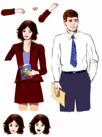
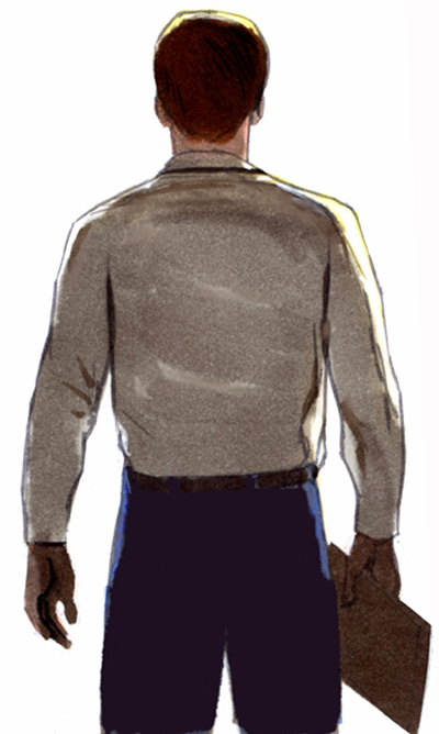
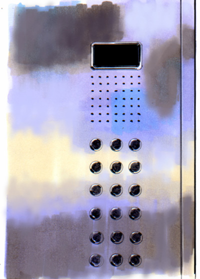
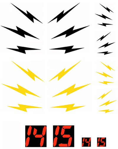
In this elevator scene the Art Director wanted flashing lights and numbers to indicate the elevator movement.
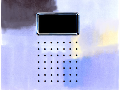

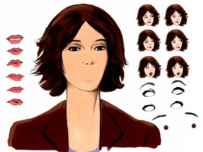
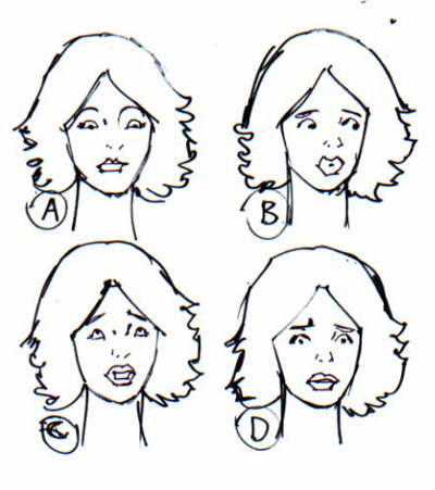
A few of my preliminary sketches for the small heads needed.
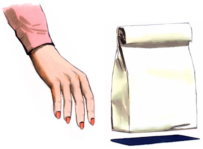
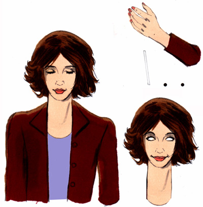
Crazy stuff to figure out so that it films properly.


In this elevator scene the Art Director wanted flashing lights and numbers to indicate the elevator movement.


A few of my preliminary sketches for the small heads needed.


Crazy stuff to figure out so that it films properly.
Friday, May 14, 2010
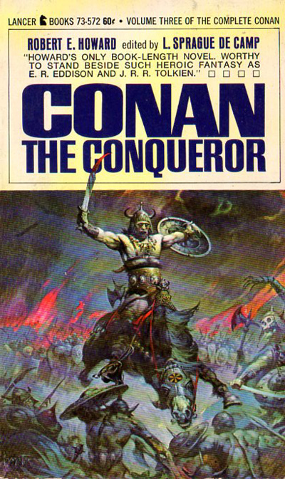
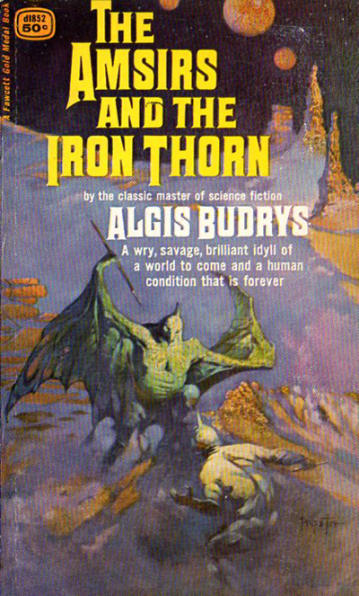
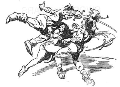
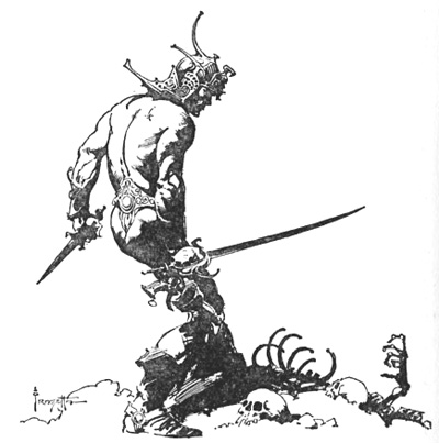
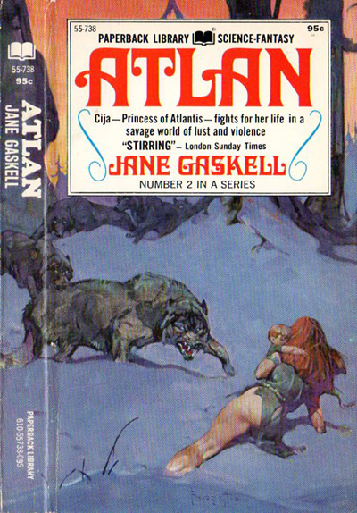
Some thoughts on Frazetta
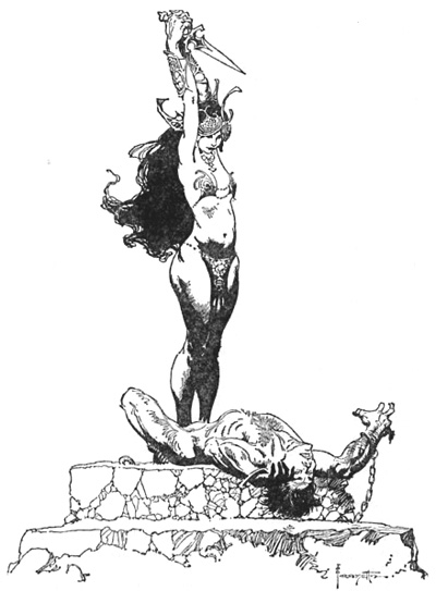
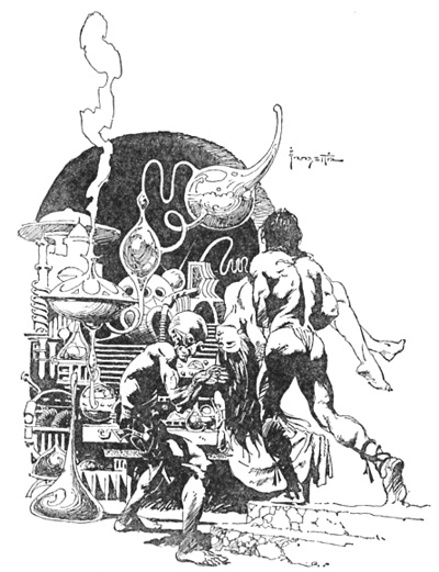
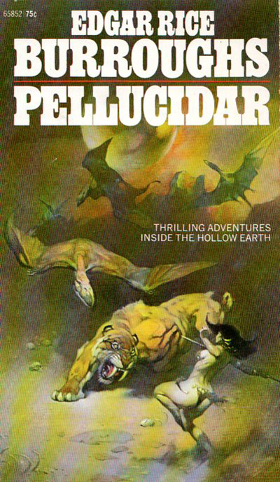
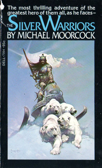
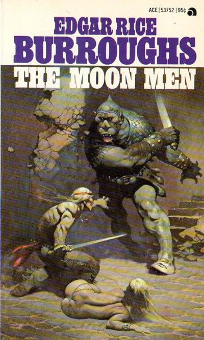
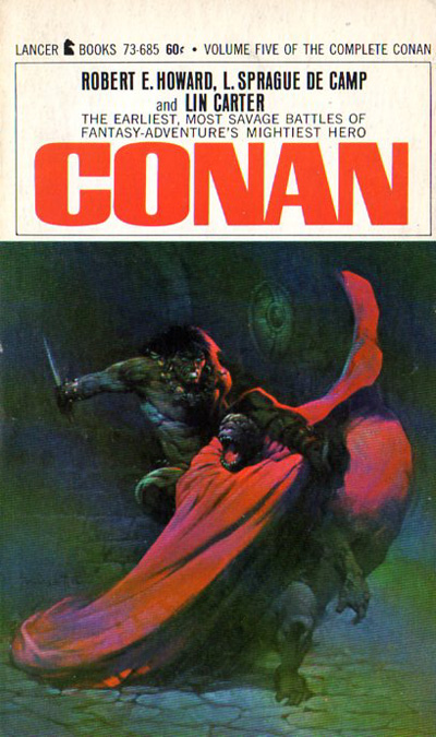
Frank Frazetta had all of the components that are required to be a great artist. He was an expert at drawing, design, composition, ideas, color, technique, determination and had his own special vision. These ingredients are an unbeatable combination that not many artists possess, he also worked very hard, which is one of the main attributes necessary for success. It also appears that he enjoyed every minute of it all.
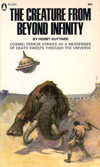
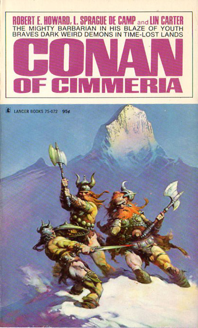
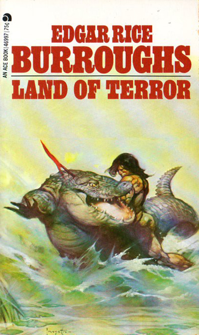
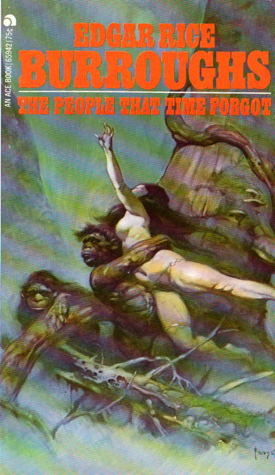
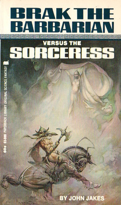
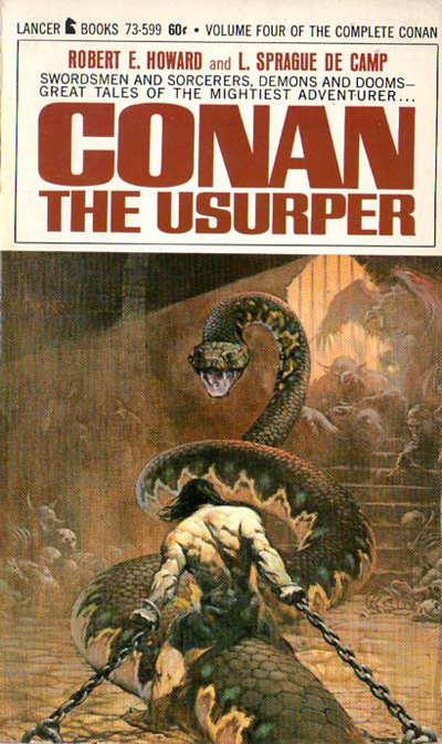
Frazetta left a great legacy that all artists can enjoy, study and learn from.


Frazetta left a great legacy that all artists can enjoy, study and learn from.
Thursday, May 13, 2010
More fantastic art by the great Frank Frazetta
The death of Frank Frazetta moved me to dig out my Frazetta file and review some of his wonderful work. I felt the readers would enjoy seeing more of his terrific images.
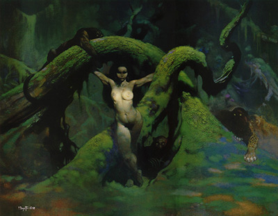
Above is another version of the painting below which was the cover art for Creepy #16. I believe that his painting was probably done before the one below. I showed the whole cover on yesterday's post.
Beautiful work, Frank !

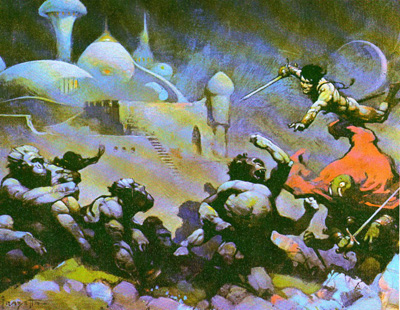

Above is another version of the painting below which was the cover art for Creepy #16. I believe that his painting was probably done before the one below. I showed the whole cover on yesterday's post.
Beautiful work, Frank !


Subscribe to:
Comments (Atom)
