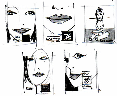
I always begin an assignment like this by doing a few small idea sketches to evaluate for design and composition.
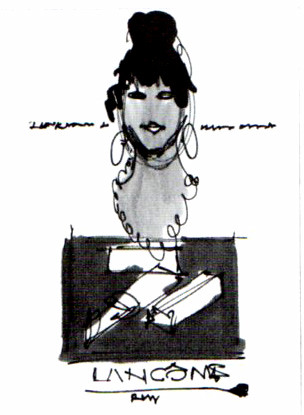
Then I pick out a version that I like and do a larger, more developed image.
I liked the larger head and drew a larger version for evaluation.
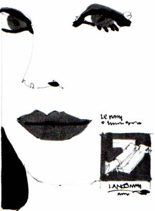
Another sketch with a large head. This is the version that I felt would work best.
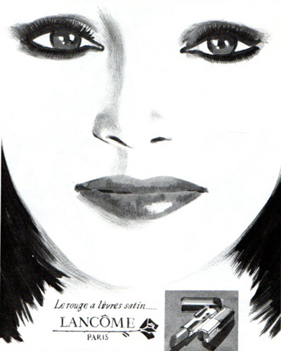
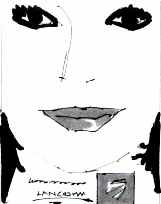
Here is the final comprehensive rendering which was done using markers and a graphite pencil on high quality layout paper.


No comments:
Post a Comment