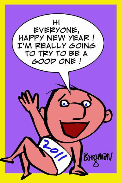
Wednesday, December 29, 2010
Wednesday, December 22, 2010
Friday, December 17, 2010
New Cartoons
Wednesday, December 15, 2010
Creating my Christmas card

I had an idea that was first sketched out very roughly with a marker, then I drew another larger rough sketch which was used as a basis for designing my Christmas card. The figure would be a drawing os Santa Claus.
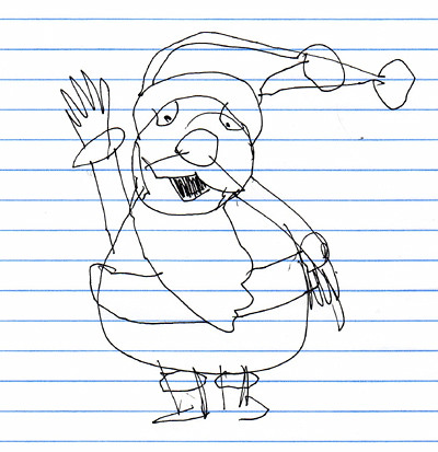
Then I made a rough sketch of Santa which would help me do a final ink drawing.
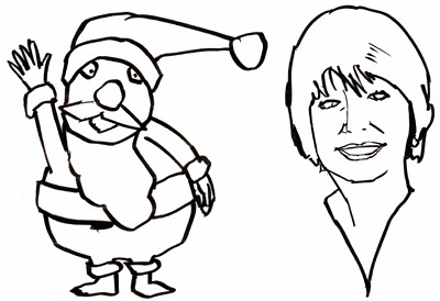
I also did a quick ink sketch of Gloria which would be used on the interior of the card.

Here is the finished cover, I combined Christmas and New Year by adding years floating on the page.
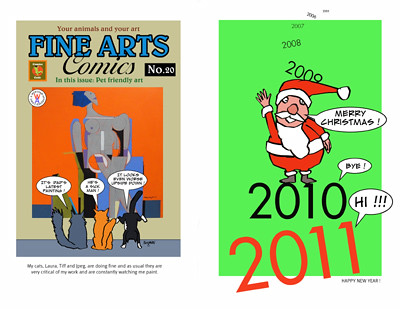
The front and rear covers. I used one of my comic book cover parodies on the back which featured one of my new paintings as well as my cats, Laura, Tiff and Jpeg.
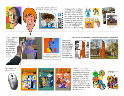
The interior of the card is kind of a visual newsletter showing some of the things that were done during the year, a new series of paintings, new comic book cover parodies and a metal sculpture that the Harbor Country Public Arts Initiative is planning to erect in Sawyer, Michigan.The card was easily created on the computer using Photoshop Elements 2.0, then was printed on my HP Color Laser 2600n printer.
Monday, December 13, 2010
More cartoons
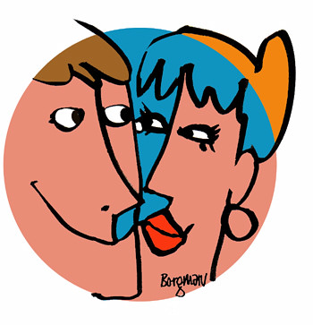
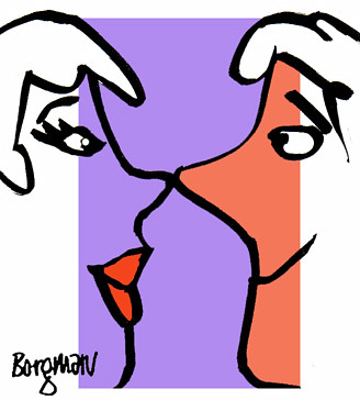
Here are some more cartoons that I drew for Gloria's blogs Romance after 50 and The romance game. She wanted a spot of color to visually liven up her page.
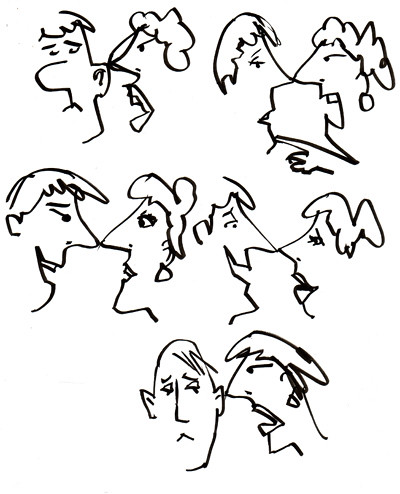
I start a project like this by first drawing a group of heads with a brush on layout paper. I really don't have any specific thing in mind, just couples interacting. I scan the most interesting drawings into the computer where I add color and on some of them, captions.
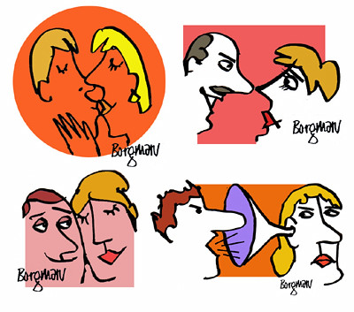
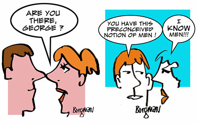
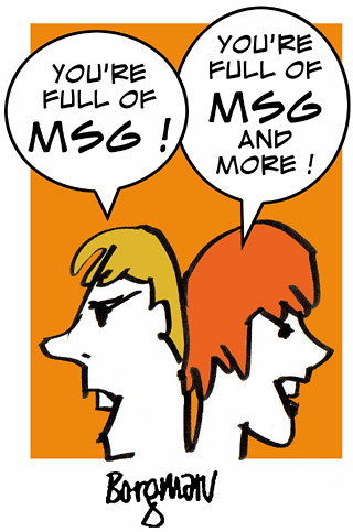
Gloria has been affected negatively by MSG in certain foods for years and she will write about it in future posts.

It's fun creating these cartoons and they add a nice touch of humor as well as color to her posts.

I start a project like this by first drawing a group of heads with a brush on layout paper. I really don't have any specific thing in mind, just couples interacting. I scan the most interesting drawings into the computer where I add color and on some of them, captions.


Gloria has been affected negatively by MSG in certain foods for years and she will write about it in future posts.

It's fun creating these cartoons and they add a nice touch of humor as well as color to her posts.
Friday, December 10, 2010
Cartoons for Gloria's blogs
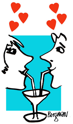
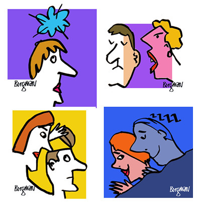
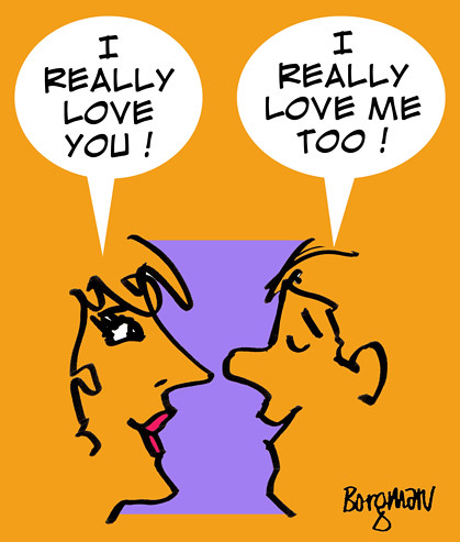
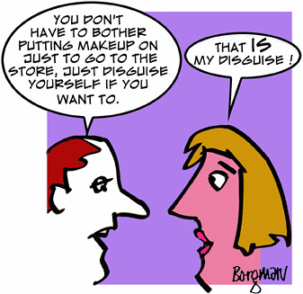
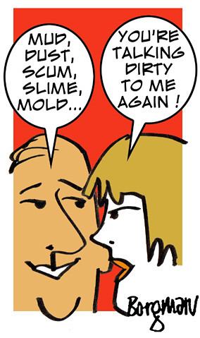
Gloria has a couple of blogs, Romance after 50 and The romance game, check them out when you have a moment. To make the blogs more visually interesting she decided to ask me to draw a few small cartoons that would add a little color and humor to the page. These were drawn in ink and scanned into the computer where the color and type was added. A fairly quick way to enhance any page.


Sunday, December 5, 2010
Opening at the Scarlet Macaw Art Center
Last night was the opening of the ROUND IN CIRCLES exhibit at the Scarlet Macaw Community Art Center in Sawyer, Michigan.
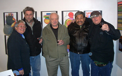
The owner of the gallery, Nifodora Dhimitra Elias-Krumrie, and a local gang of artists, Richard Hellyer, photographer, myself, Rodolfo Zarate Cuzman and John Trusk.
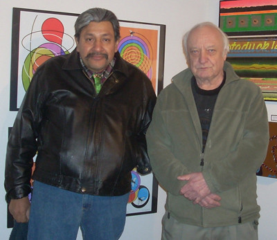
A close up of Rodolfo and myself. We usually have paintings or prints in all of the gallery's exhibitions. If you are in the area, drop by the Scarlet Macaw gallery and have lunch across the street at Fitzgerald's restaurant in downtown Sawyer.

The owner of the gallery, Nifodora Dhimitra Elias-Krumrie, and a local gang of artists, Richard Hellyer, photographer, myself, Rodolfo Zarate Cuzman and John Trusk.

A close up of Rodolfo and myself. We usually have paintings or prints in all of the gallery's exhibitions. If you are in the area, drop by the Scarlet Macaw gallery and have lunch across the street at Fitzgerald's restaurant in downtown Sawyer.
Saturday, December 4, 2010
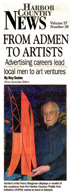
Newspaper article on my sculpture
Friday, December 3, 2010
More Fine Arts Comics
Wednesday, December 1, 2010
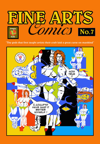
Fine Arts Comics cover #7
As I go along the art seems to be getting crazier and crazier, but it's a great way to experiment if nothing else. Here I used an ink line drawing from one of my old comic strips and scanned it into the computer, then created this design. I'm still looking for more storyboard frames to post, so far, no luck.

Monday, November 29, 2010
Comic book cover parodies
Friday, November 26, 2010
New comic book cover parodies
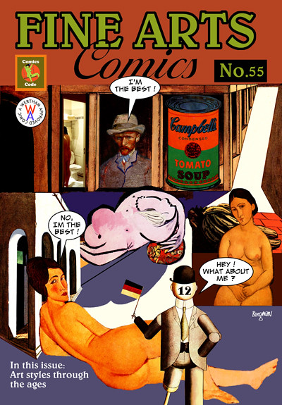
I have run out of storyboard and ad comp material to post, but I always have things that I'm working on and will continue to show new items. I will go through a few old files and may find another batch of marker renderings which I will, of course, post. Today's pieces are part of a new series of Fine Arts Comics parodies which I've been working on for the last few weeks and I may try to self publish them as a book. I've submitted many new book ideas to several publishers for the last few years and have not been able to interest any of them, so that doesn't appear to be a viable option.
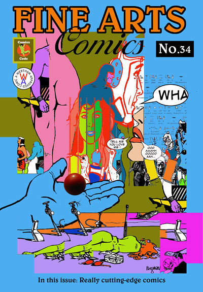
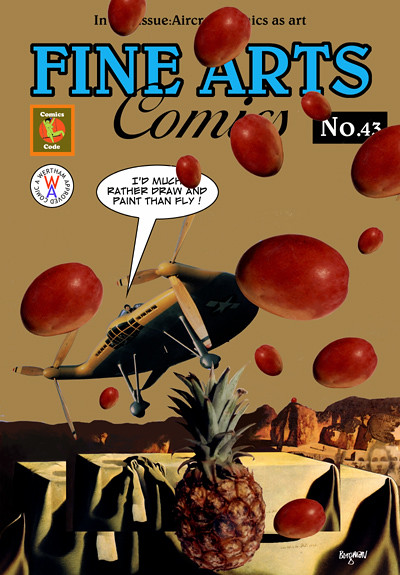
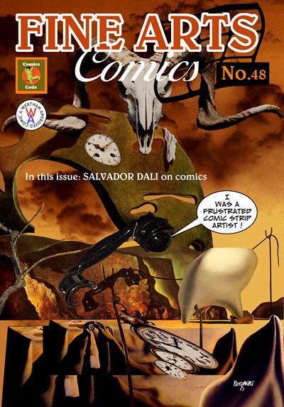
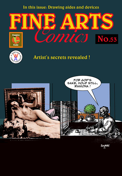
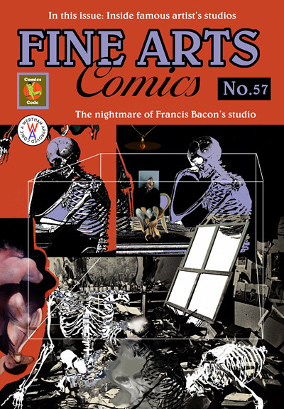
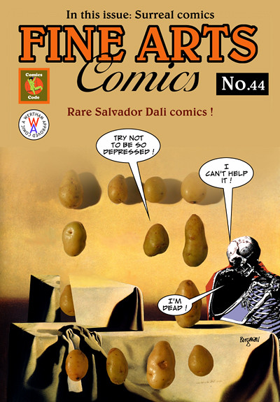
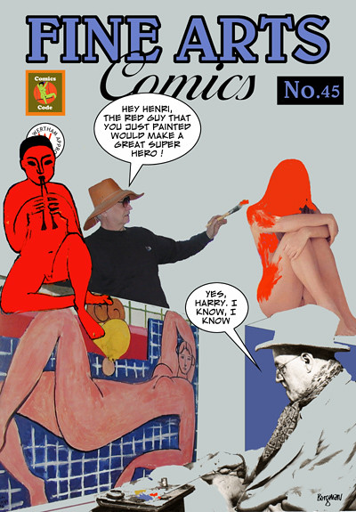
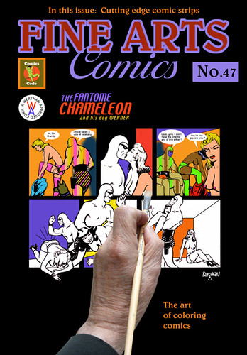
These covers are created by scanning my drawings or other images into the computer, then adding the logo and other type. It's a fun series to work on and helps me to sharpen my computer skills, it's great practice.


These covers are created by scanning my drawings or other images into the computer, then adding the logo and other type. It's a fun series to work on and helps me to sharpen my computer skills, it's great practice.
Wednesday, November 24, 2010
Friday, November 19, 2010
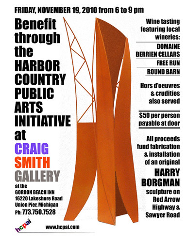
Wine tasting/Benefit tonight
Tonight is the Harbor Country Public Arts Initiative benefit to raise money to have one of my sculptures constructed and placed in Sawyer, Michigan. The event is being held at the Craig Smith Gallery at the Gordon Beach Inn in Union Pier, Michigan.
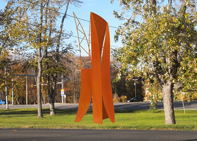
The sculpture will be 18 feet tall and constructed of steel.


The sculpture will be 18 feet tall and constructed of steel.
Wednesday, November 17, 2010
More animatic frames
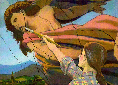
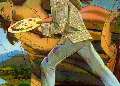
Here are more frames from the animatic that I showed in the last post. Animatics are quite complicated to produce, but can be very effective when filmed. I received many animatic assignments from my New York clients over the years. There may have been a few more frames in this particular commercial, these are all that I could locate. In fact, I've completely run out of storyboard frames to post but may find more in the future. I'll be posting more illustration work and the paintings I'm presently working on.


Monday, November 15, 2010
A complex animatic
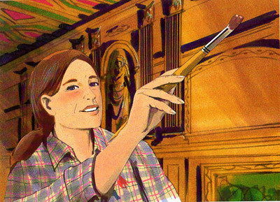
Here are some frames from a very complex animatic. Animatics usually have moving parts and when filmed, create an illusion of how the final TV commercial will actually appear. I can't remember the ad agency or client, but I did a lot of animatics for Advil, which this commercial most likely was done for. I usually had a week to complete the renderings which were done using markers on layout paper. It was a tough schedule as there normally were many moving parts such as arms and heads turning, everything had to be thought out and planned thoroughly. The backgrounds often were rendered quite large, 18 or 24 inches wide. They also required much tighter renderings than the normal storyboards.
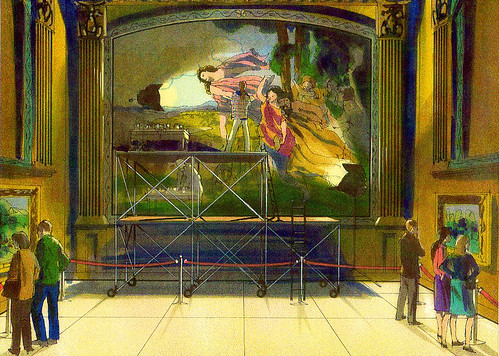
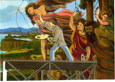
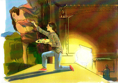
This commercial was about a woman artist that was doing restoration on a mural in a museum, this was the opening frame, a complex scene with many details.
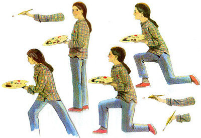
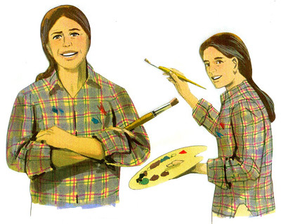
I had to render several individual figures with separate arms do they could be moved during the filming. On the next post I will show more of the frames.

This commercial was about a woman artist that was doing restoration on a mural in a museum, this was the opening frame, a complex scene with many details.


I had to render several individual figures with separate arms do they could be moved during the filming. On the next post I will show more of the frames.
Friday, November 12, 2010
More Colombo yogurt frames
Wednesday, November 10, 2010
Very tightly rendered storyboard frames
This was a 16 frame assignment for Colombo Yogurt, I don't recall the art director or ad agency, but it was done for one of my New York clients. I had a rep in New York which I worked with for years while living there, Diane Boston has a company called Way Art. She brought in a lot of great assignments for me, including many animatics.
The art director wanted tightly rendered frames with a very soft feel. This probably was another overnight assignment, as most were.


These were all rendered in the 5 x 7" size using markers on layout paper. When finished, I would scan the renderings and E-mail them directly to the art director in New York from my home in Sawyer, Michigan. For reference, I shot photos of my wife Jeanne, she worked as a professional model for years. It's very handy to have a model around the house when you are an illustrator.
I'll show the remaining frames on my next post.
The art director wanted tightly rendered frames with a very soft feel. This probably was another overnight assignment, as most were.


These were all rendered in the 5 x 7" size using markers on layout paper. When finished, I would scan the renderings and E-mail them directly to the art director in New York from my home in Sawyer, Michigan. For reference, I shot photos of my wife Jeanne, she worked as a professional model for years. It's very handy to have a model around the house when you are an illustrator.
I'll show the remaining frames on my next post.
Subscribe to:
Comments (Atom)
