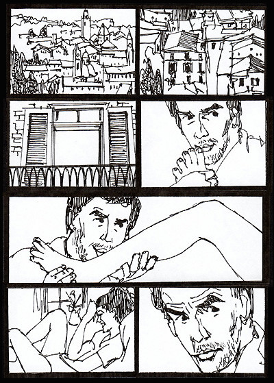
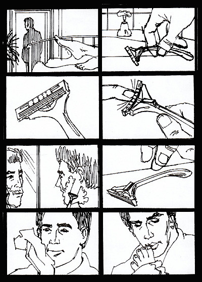
This happens fairly frequently and what I do is suggest to the art director that I do small, tight black and white line sketches that they can blow up larger if necessary. Here is an example of what I usually propose, and it works. It really would have been fun to render these frames larger and in color.


5 comments:
These are wonderful. Personally, I actually prefer drawing storyboards that are very loose as opposed to those that are drawn tightly. In my opinion, they just have more life to them. One of the things that has gotten to me are storyboards that seem to be photographs that have been adjusted in photoshop and had a splash of color drawn. They leave me cold.
"...photographs that have been adjusted in photoshop and had a splash of color drawn."
I actually meant to write "a splash of color tossed on."
Hi Oscar,
Yes, I agree, I love storyboards and other renderings that are done looser and with more life to them. My former New York rep tells me that a lot of the comp work being done today consists of artists altering stock photos which sounds very bland and uninteresting.
Harry
Hi Harry,
I ow pretty much all your books and one of the things I love about them is the work has a very tactile feel to it. You can see your mind thinking behind those illustrations, whether created with a pencil, pen and ink, marker, etc.. The drawings in your layout book, although comps, have the liveliness that I like. I can't imagine getting excited by an art technique book that has stock photos being filtered, etc.
The only book that I've really enjoyed recently is "Drawing Shortcuts" by Jim Legitt. The art, by the author is loose and fun. Perhaps I like it for that reason.
Hi Oscar,
Thanks for your comments, I'm pleased that you enjoy my books.
Harry
Post a Comment