Monday, May 30, 2011
Friday, May 27, 2011
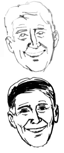
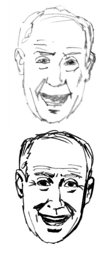
Quick head sketches
Wednesday, May 25, 2011
Aircraft paintings
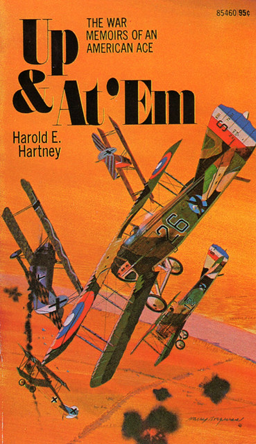
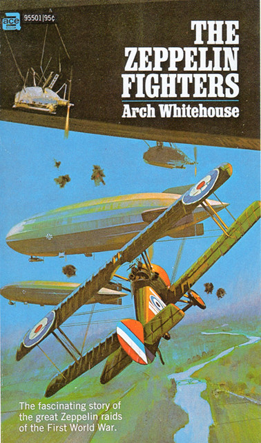
A couple more paperback book covers featuring aircraft. I have always found airplanes very interesting since I was a boy building all kinds of flying models. Illustrating aircraft can be quite complex, especially military airplanes because of the squadron and other markings as well as the type of camouflage used. There are plenty of experts out there that will examine every little detail of your illustration. I have a extensive collection of aircraft books which I use as reference material when getting assignments like these.


Monday, May 23, 2011
Paperback book covers
Recently I found a paperback book on the internet that I had painted the cover for in the early 1960's. When I received the book I got a surprise, the book was a double edition and had another cover that I had painted on the other side. The covers were painted using acrylics on illustration board.

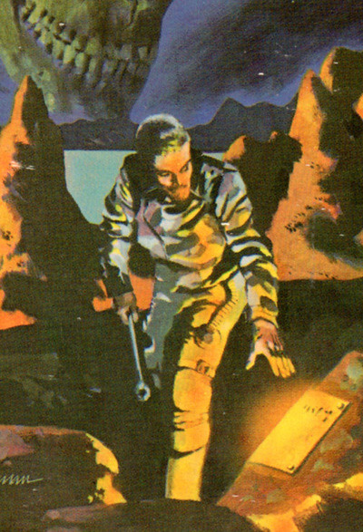
A blowup section showing some of the detail in the illustration.
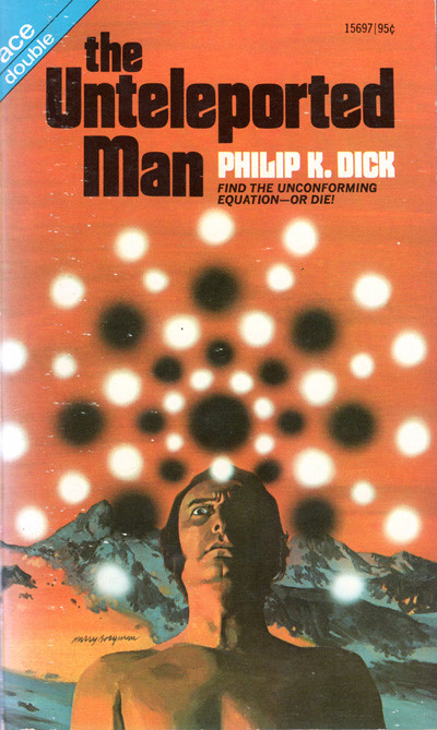
On this illustration I used myself as the model.
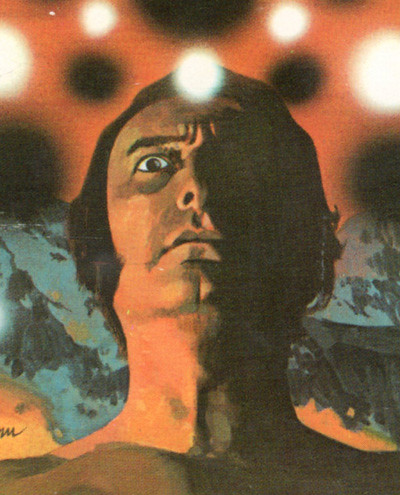
A blowup showing the detail in the painting. The glowing white and black spots were done using an airbrush. I only did about a dozen paperback covers as I was very busy with automotive assignments. I wish now that I had done more, they were a lot of fun to illustrate.


A blowup section showing some of the detail in the illustration.

On this illustration I used myself as the model.

A blowup showing the detail in the painting. The glowing white and black spots were done using an airbrush. I only did about a dozen paperback covers as I was very busy with automotive assignments. I wish now that I had done more, they were a lot of fun to illustrate.
Friday, May 20, 2011
A moody storyboard
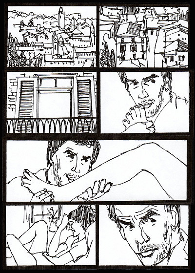
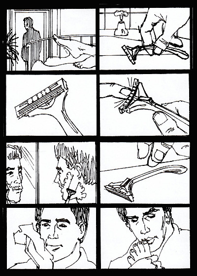
A series of storyboard frames for TDK, not sure of the ad agency, it probably was done for Doner. I had a reputation for rendering moody scenes and whenever an art director wanted a certain mood, I would get the assignment.
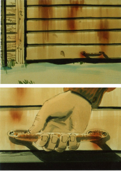
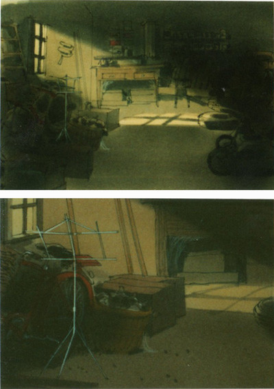
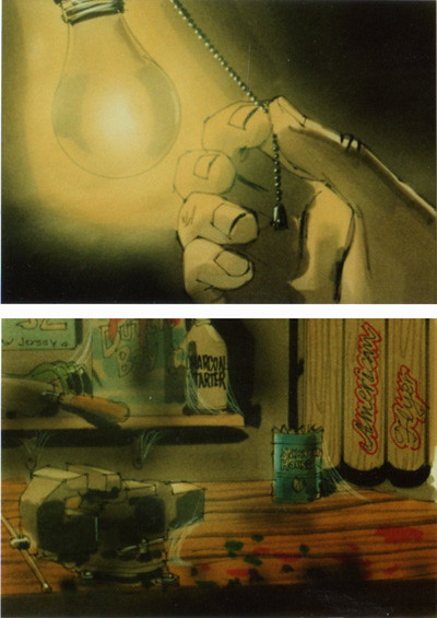

Again, these frames were all 5 x 7" and rendered using markers on high quality layout paper and delivered over the internet. There may have been more frames, these are all that I found and they probably had the usual tight deadline.


Again, these frames were all 5 x 7" and rendered using markers on high quality layout paper and delivered over the internet. There may have been more frames, these are all that I found and they probably had the usual tight deadline.
Wednesday, May 18, 2011
Storyboards for Doner
On November 10th of 2009 I posted a series of storyboard frames done for Doner Advertising. It consisted of a boy taking his new bike out for a ride in the rain. In an old file I found another version of the same idea, this time the boy takes his new bike out for a ride in the snow. I'm not sure why there were two versions, one must have been scraped.
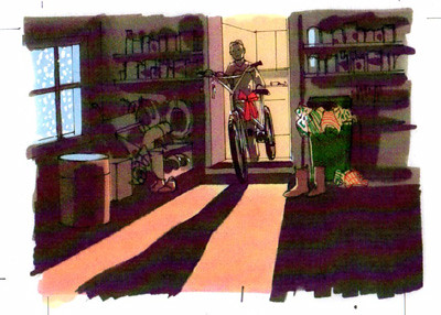
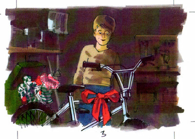
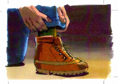
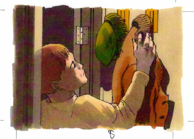
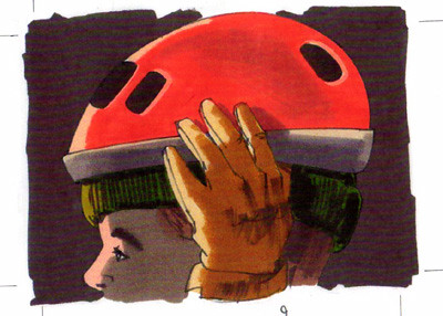
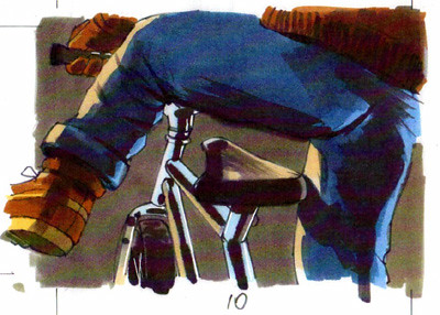
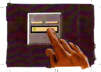
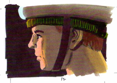
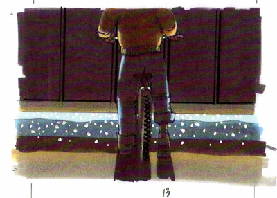
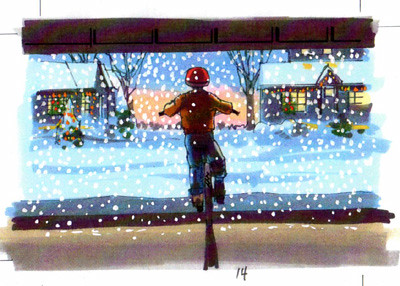
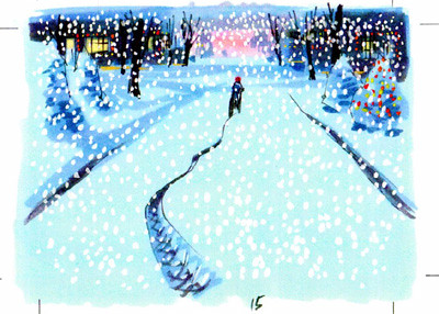
The art directors at Doner used to call me to work on premises frequently for a week or two at a time when they would have a big project or important presentation to prepare. One of the problems with working at the agency is that I have no reference material and everything must be drawn from scratch. I can't drag my reference files with me from Sawyer to Detroit. So, it's a bit tougher and a lot of pressure when one works at the agency. These were all 5 x 7" frames all rendered with markers.


The art directors at Doner used to call me to work on premises frequently for a week or two at a time when they would have a big project or important presentation to prepare. One of the problems with working at the agency is that I have no reference material and everything must be drawn from scratch. I can't drag my reference files with me from Sawyer to Detroit. So, it's a bit tougher and a lot of pressure when one works at the agency. These were all 5 x 7" frames all rendered with markers.
Monday, May 16, 2011
Another tight deadline
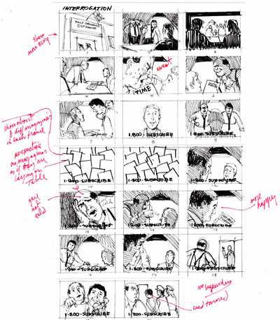
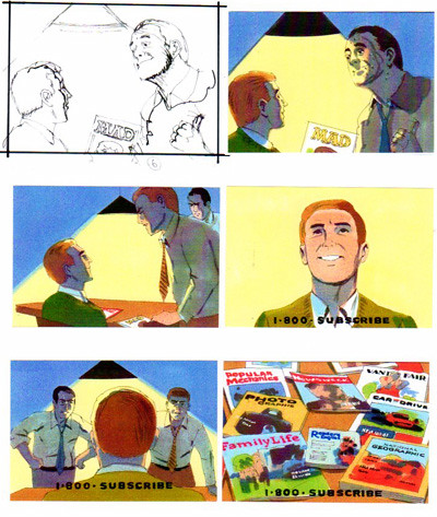
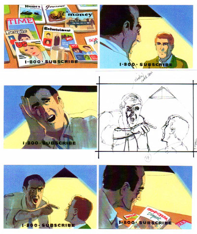
When the deadline is impossible, often I will do very small, fast sketches to send to the art director. Then we discuss the frames and I make notations on the changes or additions necessary. After doing tighter sketches, I render the frames in color in the 3 x 4" size, scan the finished frames and send them off, meeting another very tough deadline and usually making everyone at the ad agency very happy and relieved.


Friday, May 13, 2011
What to do when you have an impossible deadline
This happens fairly frequently and what I do is suggest to the art director that I do small, tight black and white line sketches that they can blow up larger if necessary. Here is an example of what I usually propose, and it works. It really would have been fun to render these frames larger and in color.


Wednesday, May 11, 2011
Markers on tracing paper
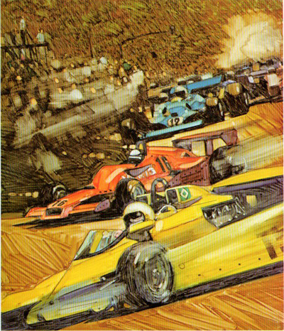
For most of my comp and storyboard renderings I used markers on high quality layout paper. However, very interesting effects can be achieved by using markers on tracing paper or on glossy surfaced paper. These are two rendering done on tracing paper, they were used in my book ART & ILLUSTRATION TECHNIQUES.
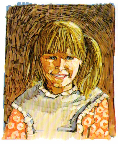
This rendering was used on the cover of the book.
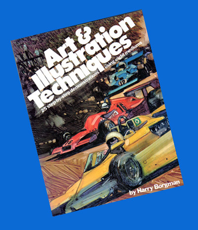


This rendering was used on the cover of the book.

Monday, May 9, 2011
Portrait of Sukri
When I was living and working in Paris one of my best clients was the Lintas advertising agency. They sent me to Jakarta and Singapore to teach their art staffs how to render ad comps and storyboards. It was an exciting venture as they also sent my wife and I to Bali as a bonus. We spent a week there and it was a great place to visit. I was working on a book for Watson Guptill Publishing titled DRAWING IN PENCIL and did these drawings for examples of colored pencil drawing and charcoal drawing.

I began the study by first doing a line drawing on Strathmore four ply regular surface bristol, using a medium warm gray 962 prismacolor pencil, then I washed Designer's Colors Ivory black over the hair section of the drawing. I added a wash of raw umber over the face.

I then began to draw in the facial details using a black pencil. I added a linear texture to the hair. I added various tones to the face and softened the lines using Bestine and a paper stump.

I kept working on the face, carefully blending the strokes as I drew. I gradually built up the tones until the drawing was finished.
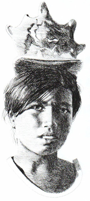
Another drawing of Sukri, she was selling shells on the beach and always had one on her head. The drawing was done on Arches textured paper using a charcoal pencil.

I began the study by first doing a line drawing on Strathmore four ply regular surface bristol, using a medium warm gray 962 prismacolor pencil, then I washed Designer's Colors Ivory black over the hair section of the drawing. I added a wash of raw umber over the face.

I then began to draw in the facial details using a black pencil. I added a linear texture to the hair. I added various tones to the face and softened the lines using Bestine and a paper stump.

I kept working on the face, carefully blending the strokes as I drew. I gradually built up the tones until the drawing was finished.

Another drawing of Sukri, she was selling shells on the beach and always had one on her head. The drawing was done on Arches textured paper using a charcoal pencil.
Friday, May 6, 2011
An occasional magazine illustration
While working in Detroit on automotive related illustrations I also was represented in New York by Neely Mulvey Associates and used to do some illustrations for various magazines, the example shown was for the August 1963 issue of Saga Magazine. I really didn't do a lot of magazine illustration as I was very busy in Detroit, but it was a nice refreshing break from the hard boiled automotive work.


Wednesday, May 4, 2011
More MONSTERMAN art

Here are some more sketches from my MONSTERMAN book that I sold through ads in comic books in 1974. The book was specifically done for kids that liked to draw and had a lot of examples and hints for aspiring young artists.
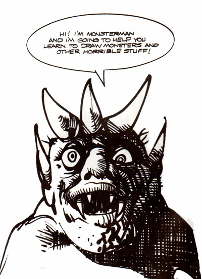
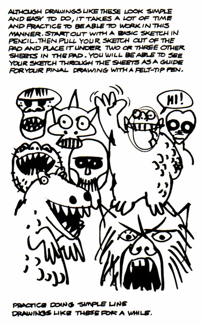
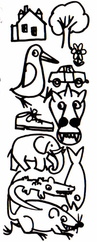
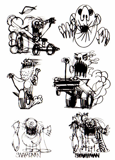
I had a lot of fun doing this book and it eventually led to writing many "How to..." books for Watson Guptill Publications.
Monday, May 2, 2011
More Storyboard frames
Another group of 5 x 7" storyboard frames. Not sure of the product, client or ad agency. It's kind of a strange concept as sometimes the scripts can be. There may have been a few additional frames which might have given the sequence more sense. Again, these frames were all rendered using markers.
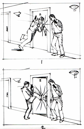
My pencil roughs that are used as underlays when doing the final renderings.
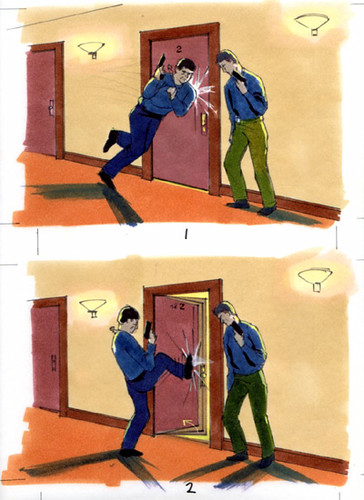
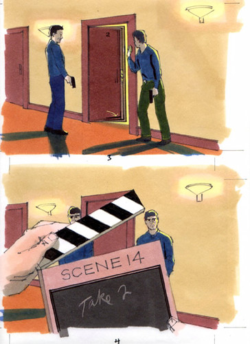
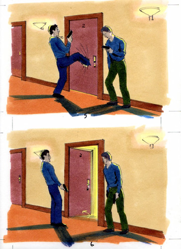
In frame 5 the guy kicks a hole in the door, but in frame 6 it's gone. I can't remember why the hole disappeared, it must have been in the script that way.

My pencil roughs that are used as underlays when doing the final renderings.


In frame 5 the guy kicks a hole in the door, but in frame 6 it's gone. I can't remember why the hole disappeared, it must have been in the script that way.
Subscribe to:
Comments (Atom)
